Draft Logo

Panhandler3

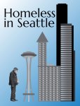
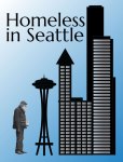
Another round of creative thinking, and how to portray homelessness in Seattle.  For this assignment, I have used a variety of techniques to create a graphic using handmade vector graphics.  The assignment requires the use of all vector graphics, which I have done here.  The one “image” that I have modified, was cut out of a photo I used in the previous project, but I have used the “live trace” function within Illustrator to create a silhouette-like scalable vector graphic that I would not have otherwise been able to create from scratch.  I have used this function many times in the past to take rasterized images that would otherwise scale very poorly, and create an artistic rendering that is infinitely scalable.

In creating this I had two concepts in mind, one reminiscent of the evolution of ape to man graphic, and the other being a play on the title of the movie “Sleepless in Seattle.”  To create this, I looked up images of some of the iconic buildings in Seattle, and chose the Columbia Tower, the Smith Tower in Pioneer Square, and, obviously, the Space Needle.

To create the buildings, I drew a variety of overlapping rectangles, and “eyeballed” them until they resembled the overall shape of the Columbia Tower and the Smith Building.  Since the Columbia Tower has curved façades, I chose to insert rectangles to resemble the different floors, and rounded the corners to give an artistic impression of the rounded shape.  The Smith Tower is a similar melange of rectangles in the general shape of the building.  To create the diagonal line of motion, I sized the building to create not only a hint of an “up” arrow with the building but to balance the form of the piece as well.

I then started building the Space Needle, using the ellipse tool to create a single ellipse, that I then copied and resized to create the profile of the top of the Space Needle.  I added a triangle to simulate the spire, and then went about trying to create the legs of the needle.  This was the most difficult part, as I had to warp a rectangle to resemble one of the legs.  Once I had one made, I copied it, and then used the reflect tool to create mirror copy.  I then had to adjust the tilt of the legs, as the real Space Needle’s legs meet much higher up than the center of the tower.  With that adjusted I made one additional rectangle leg made the cross pieces and lower observation deck that go lower on the legs.  I placed a light stroke around the shapes to offset them against the background in some of the versions.

With all of the buildings made I resized each one to create the diagonal line I had originally intended, starting with the caricature of a homeless man, and moving up to one of the tallest buildings in the world.  Then I started adjusting the color of the background, and of the buildings to look at the various options, from stark black and white to a more muted grayscale.  I have posted some iterations here, and I would enjoy any feed back as to which presentation is more effective.

If the image of the homeless man is not allowable for the purpose of this assignment, I would change that figure to one of a stylized tent.  Also, the wording could be changed to be more of a corporate logo for a non-profit agency.

P.S. If you would like a great link for using live trace, http://www.vectordiary.com/illustrator/illustrator-tutorial-perfect-silhouette-with-live-trace-tutorial/


3 responses to “Draft Logo”

  1. Hi Marcus!

    You did a really nice job on this assignment. I like how the tall buildings on the right are balanced out by by the heavy text and the man on the left, and the diagonal direction you intended in the piece is really pleasing to the eye. I’m also really impressed with your Illustrator skills! I have no idea if you will be allowed to keep the image of the man in your logo or not, but either way, it looks fantastic. I’m still trying to familiarize myself with Illustrator as I’ve never had to use it before this semester, but I will definitely be trying out the “Live Trace” tool in the future. And, if you do need to take the man out for the purpose of this project, I think a tent is a great idea. It would really do justice to your message, especially in that it would be up against some of Seattle’s most famous buildings.

    As far as the variations of the images you provided, I think that I prefer the one that you posted at the top as your main image. I like the different gray tones and think that they really help to highlight the different elements used in your design. As for any improvements I’d suggest, I might either darken up some of the grays or lighten up the gradient of the blue background because it kind of feels a little washed out around parts of the Space Needle. I also wonder how the man might scale, and if the detail might get lost in a smaller image. Maybe you have already tried and it’s a non-issue, but if you haven’t and it is a problem, I would suggest creating the logo again with the tent in place of the man and see how that compares.

    I hope this feedback is helpful, and good luck on your final draft!

    Shanna

    Like

  2. Wow, Marcus! This Illustrator newbie is really impressed by your skills with the program. It’s going to be hard for me to provide feedback in terms of the program tools. I love the concept of the logo. You did a good job taking something familiar that people can relate to and incorporating it with an issue that people need to be aware of.
    I love the lines that are created with the skyline, but I’m wondering how it would look if you incorporated the Space Needle into the skyline. The separation of it, and its size in comparison to the other buildings, seems slightly off to me. I’m guessing realistically the other buildings are larger than the Space Needle but the Space Needle carries more weight in the design since that is the most recognizable image. Secondly, if you mirrored the image of the man so that his back was facing the city, I’m wondering if it would add to your message. His line of sight right now has him looking directly into the Space Needle, it seems.
    Your font choice seems to fit really well! Great job on this!
    Kendra

    Like

  3. Looking at the image a few days later, I can see a few things I would like to add some additional detail to, and maybe finesse the buildings a bit more. I will take the homeless man and put him in full silhouette to satisfy the requirements of the piece, with maybe a few cutouts so the details a better understood. The reason I didn’t put it in full silhouette in the first place was the invisibility of the sign and the beard just looked funny, so I will try and see if there’s a black and white compromise that will work. Being a photographer, I always am too driven toward the realism of a piece, and the more I work on it the more complex it gets, which in some ways is the opposite of a logo’s intent. I’m sure I will change a few other elements…maybe bringing in a background other than a gradient. I’ll have to see what I have time for…I’m moving to a new house this weekend so it will be a busy time to squeeze everything in.

    Like

Leave a comment